

When a hydroponics sales rep got fed up of calculating airflow for all of his clients customers, he asked us to create a tool for these customers to use to lighten his workload.
Client
Phresh
Aim
Develop an online tool to allow hydroponic growers to calculate how much air needs to be circulated around their room.
Team
- Web developer
- UI/UX Designer (me)
Goals
- Shelter users from the complexity of the underlying equations.
- Limit the number of inputs, keeping them simple and consistent.
- Be inclusive to the companies customers in Europe, Australia and North America.
- Present inputs and results in a simple and easy to understand way.
- Give users contextual product suggestions based on their results.
Problem Analysis
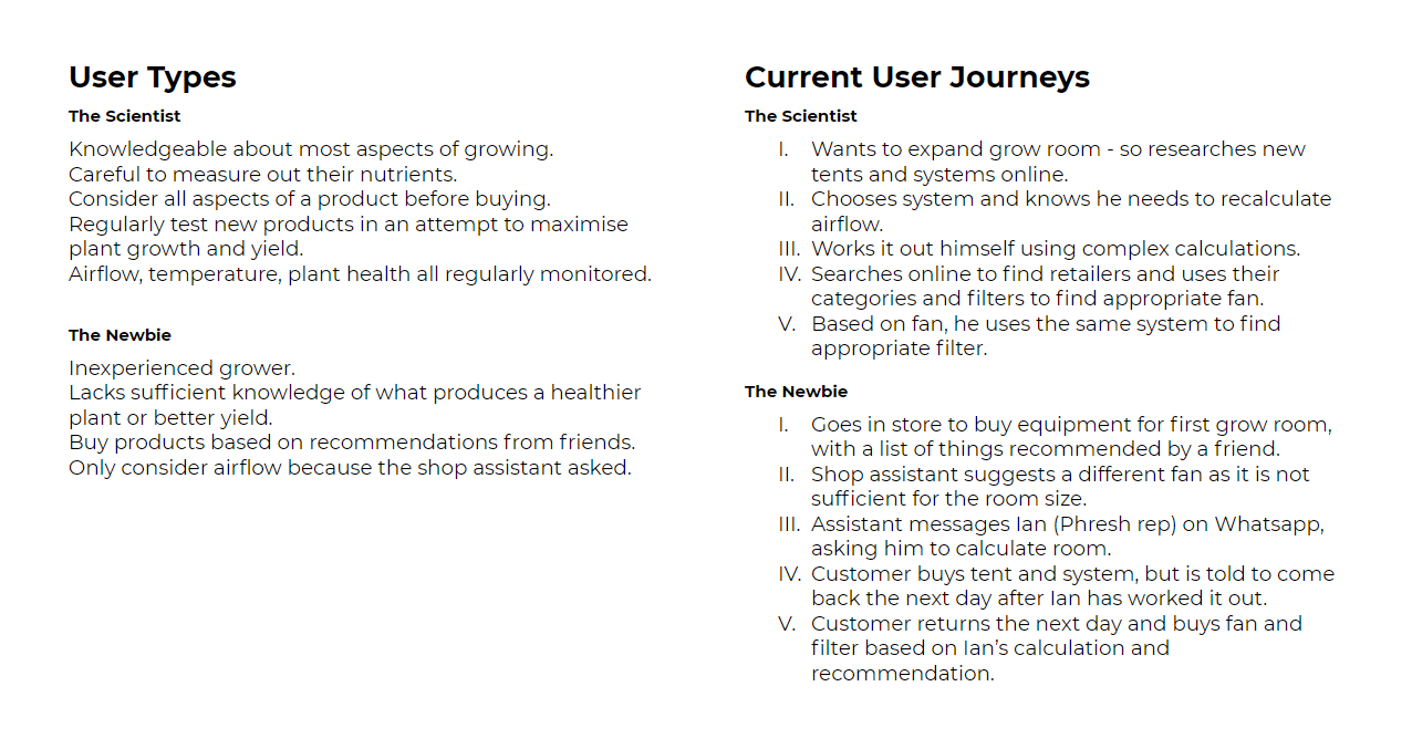
We began by asking the sales rep all about who he does the calculations for, why he does them and what they involve.
Analysed existing calculators with staff from a local grow shop, asking why they weren't used by hydroponic growers.
Numerous inputs on existing calculator sites were overwhelming to first time users and they lacked options for input units.
Users in Europe are used to meters and meters cubed per hour, while North American users are more familiar with feet and cubic feet a minute, so we wanted to include a simple way for users to swap between units.
Affinity Mapping and User Journeys
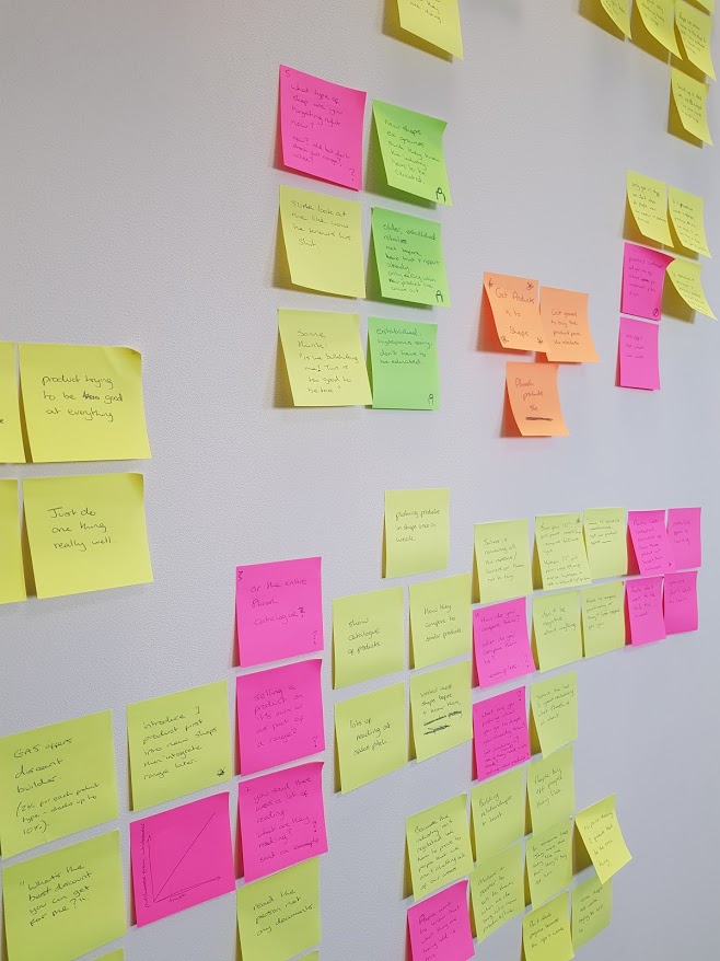
We sorted through the information by creating an affinity map.
We used the map to draw up some typical user journeys
and broke the equations down into inputs and outputs.
Card sorting helped determine which inputs should be grouped together.
Using the user journeys we explored the most effective order to present the inputs to users.
Conceptualisation
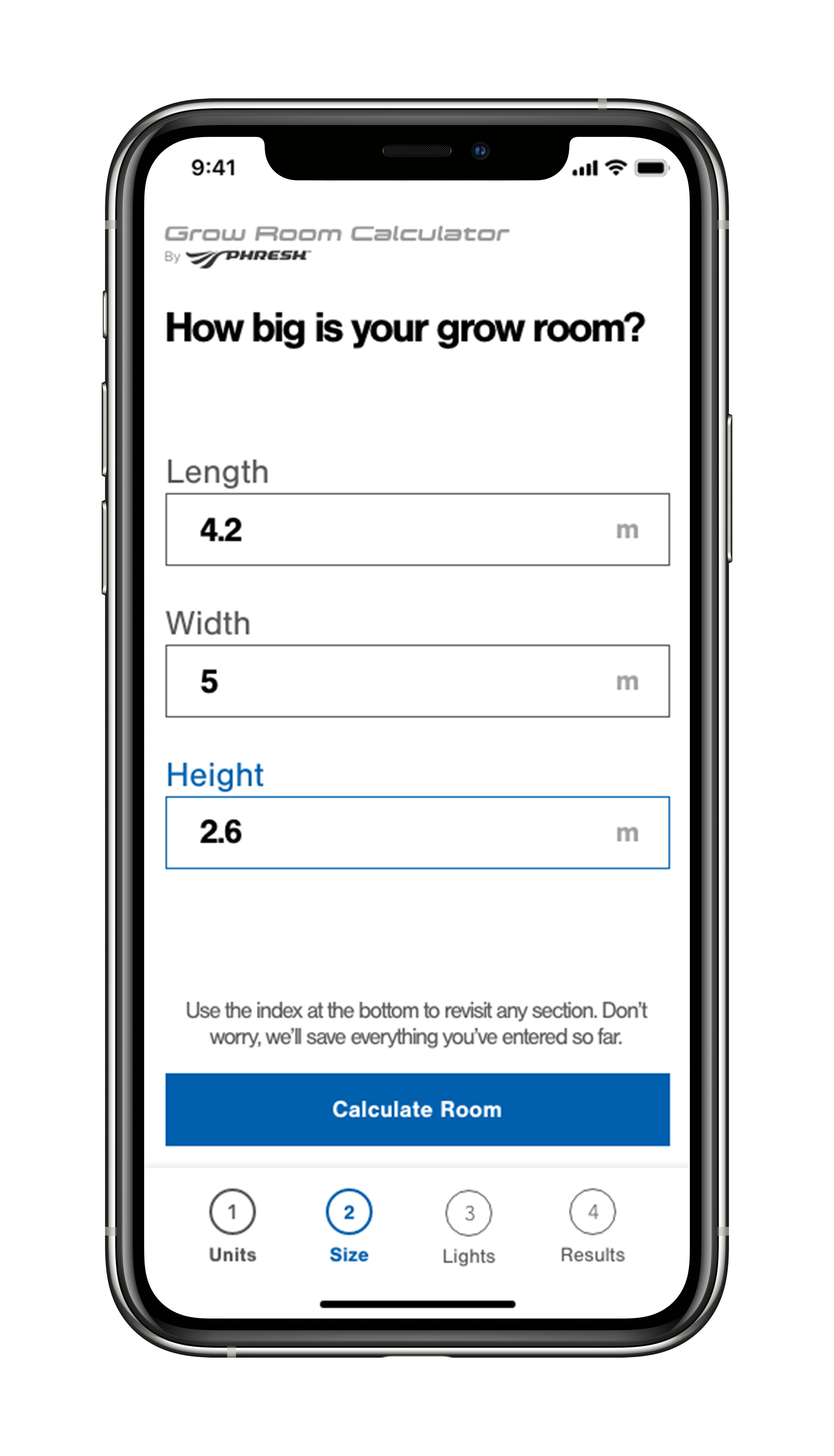
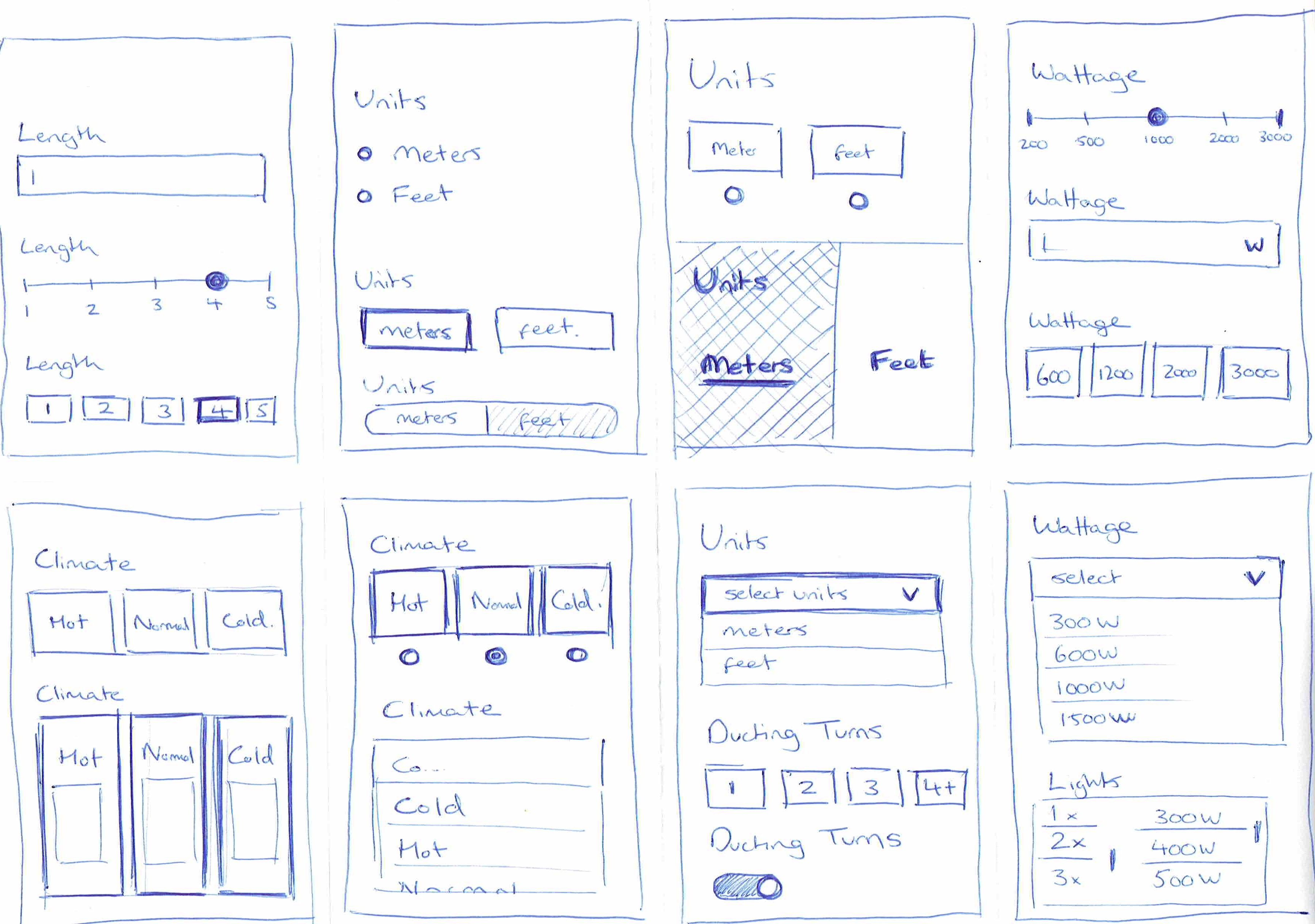
We conceptualised the most effective ways for each to be inputted with wireframes and low fidelity XD mockups which we tested with the shop staff.
We decided on text fields for dimension inputs and radio buttons for multiple choice options. These two input types could be used throughout to give users familiarity throughout.

Prototyping and Testing
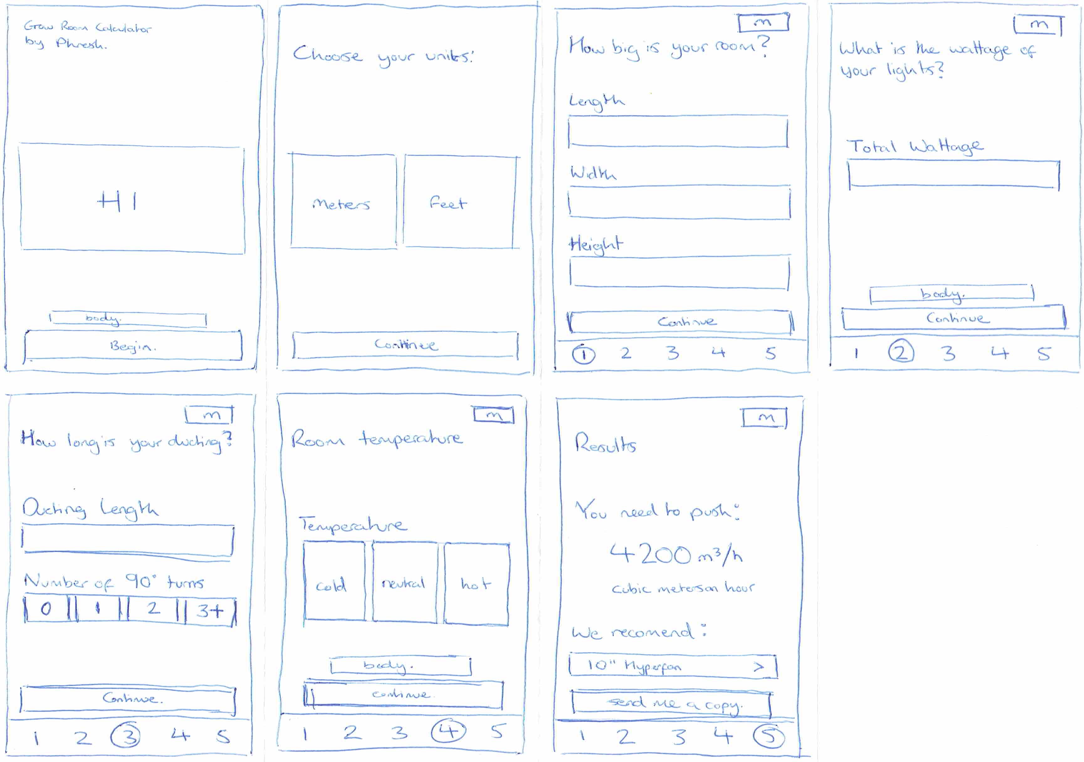
Next we built an initial prototype using ProtoPie, as it allowed us to take the data inputted by users to give them realistic results at the end. We ran usability tests to look for paint points.
When showing these mockups to potential users, many mentioned that even though the units were shown in the top right corner, they still wanted reassurance on each field.
We included some placeholder text of "2.6" meters within the 'Height' field under the assumption that some users may be unsure of the height of their room and may need guidance on a typical ceiling height.
However after several instances of users trying to proceed without entering a room height - confusing it with already being filled in - we decided to remove the placeholder text.
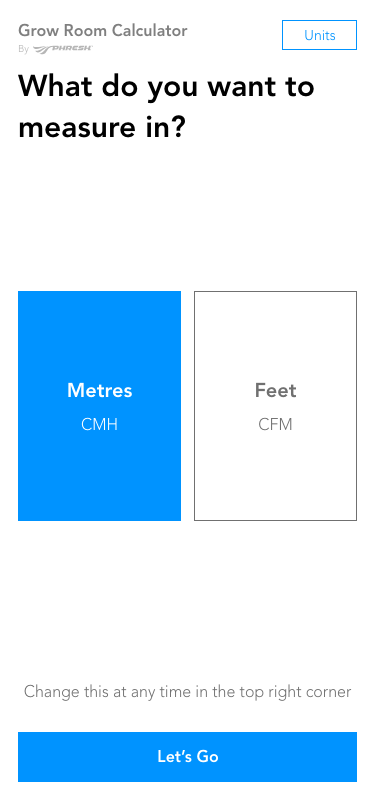
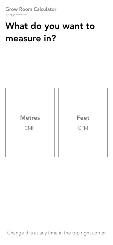
A 'Continue' button was included on the Units section to allow users to amend their selection before continuing, but in testing it caused confusion as participants expected that by selecting the unit they had done enough to proceed to the next section. Testing also showed a 100% success rate in selecting the desired unit, so the 'Continue' button was removed.
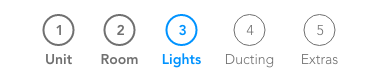

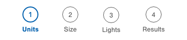
A navigation bar was included to highlight to users how much further they had to proceed before getting their results. The first instance of this did not include a 'Units' or 'Results' tab.
Units were designed to be considered a seperate feature for users, hence the inclusion of a 'Units' button in the top bar. We had included this under the assumption that users may want to use different units for different sections of the process.
Testing proved to us that this assumption was wrong and the seperate feature could be confusing to users. Therefore we decided to instead include the 'Units' feature as the first step in the process.
The lack of a 'Results' tab in the navigation was excluded initially as an oversight. Testing illustrated to us that including one would give users a motivating end goal which the proceeding tabs aimed towards, so we added the results page as the final tab.
Including units and results as tabs helped to simplify users mental model and more easily navigate between all areas.
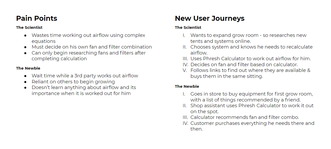
When reviewing the prototype, the rep asked us to remove the ducting and climate sections. (While including these parts of the calculation was intended to improve the results accuracy, the results we were getting appeared somewhat high and we needed some time to refine these more compex parts of the equation.
We removed the sections but retained and documented the code and calculations we had completed up to that point in order to return to them at a later date.

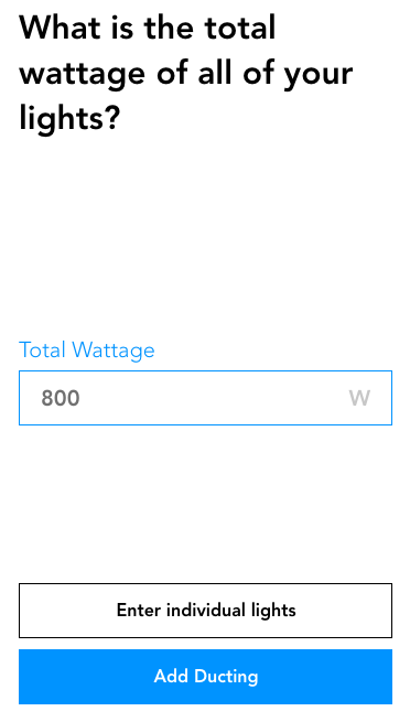
The 'Total Wattage' field was included on the assumption that users would know the combined wattage of all of their lights. Testing showed this was not the case, as on more than one occasion, users closed the prototype and opened up a calculator to work this out.
This led us to decide to opt for 'Number of Lights' and 'Individual Light Wattage' options as the default on the 'Lights' section. We also included a secondary 'Total Wattage' button for users to return to the initial input method should they choose.
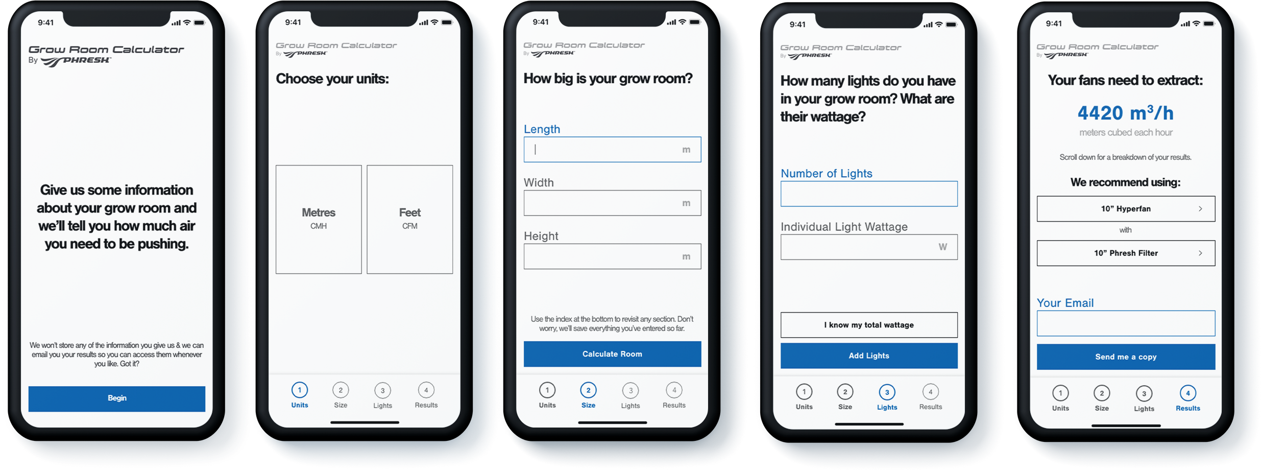
Final design
The final design allows users to quickly and accurately calculate the airflow they need
just 3 steps.
The numbered sections at the bottom allow users to go back to amend their entries and change units.
Results from testing showed most users know the Individual wattage of each of their lights, so the lights section allows them to calculate their total wattage without having to use a calculator, but also gives them the option to enter their total wattage if they know it.
The results are displayed in an easy to understand manner, in the users selected units. They are also shown a recommended fan and filter combination which is ideal for their room, offering them links to purchase both products or recieve an email their results to save them for later.
What I learned
The project highlighted the importance of clear and regular communication with stakeholders, developers and end users. More conversations throughout the project could have stopped us from going to build to early.
The importance of getting the prototype, whatever stage it is in, in front of as many people as possible.
That there is no final design as there are always ways it can be improved - user testing helps to realise this.
Further development
I would like to spend more time optimising the 'Lights' section. I think that if more thought and time was given to the field text and explanatory copy, the 'Overall Wattage' button and resulting section could be removed.
