OCD
To design a product showcase website for an odor neutralising brand and produce all assets in 3 weeks.
We were brought in midway through the sites development, to see how we could improve the user experience of the site which the company's inhouse web developer was producing.
When analysing the work so far, I noticed an opportunity with how OCD's products are organised and how this could be presented to customers.
The company offers 1 product - an odour neutraliser, which is available in 3 types:
Each type is available in 5 different fragrances (with more fragrances to be added over time) and the gel was available in 3 different sizes.
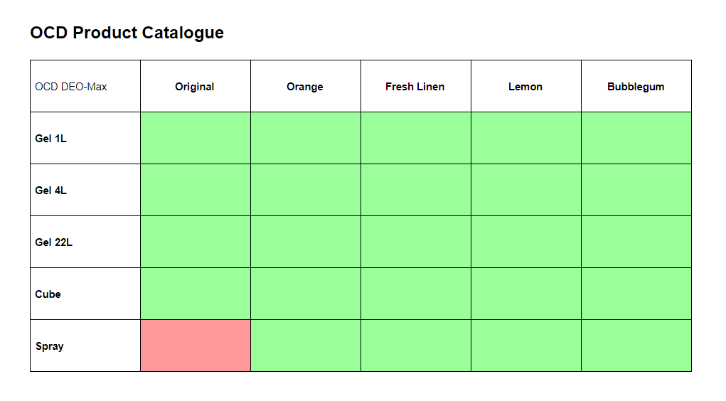
The goal of the site was to allow users to explore the brand's various product types & fragrances, and order a sample. Their developer had used individual cards to display every product type, fragrance and size combination. This resulted in a lot of navigating back and forth between the catalogue and product pages.
Rather than navigate through all 24 different combinations using cards, I suggested using a single product page, with fragrance and type selectors allowing users to mix and match to create all of the different variations.
Using this method, I believed we could reduce the use of the back button when exploring the product variations, instead keeping them all on one easy to navigate page, and making product variation exploration more seamless.
After pitching the idea, we decided that redesigning the site from scratch, based around the product exploration concept would offer a large benefit to the user experience.
While this gave us greater creative freedom, it increased our scope of work with the time frame remaining the same.
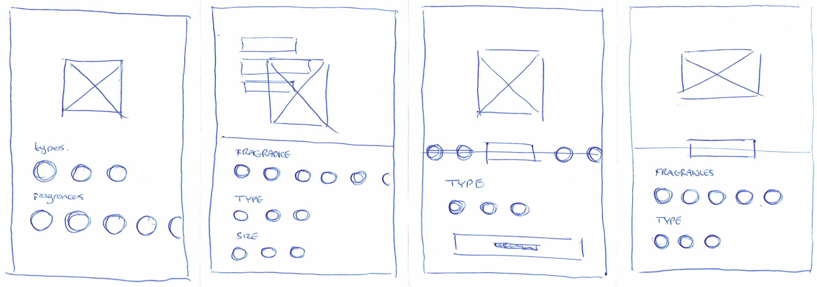
Wireframed ideas were turned into simple prototypes. We explored different ways of interacting with the product catalogue from a single screen, including the best ways to present all of the different options in an easily digestible way, while maintaining affordances for how they were to interact with it.
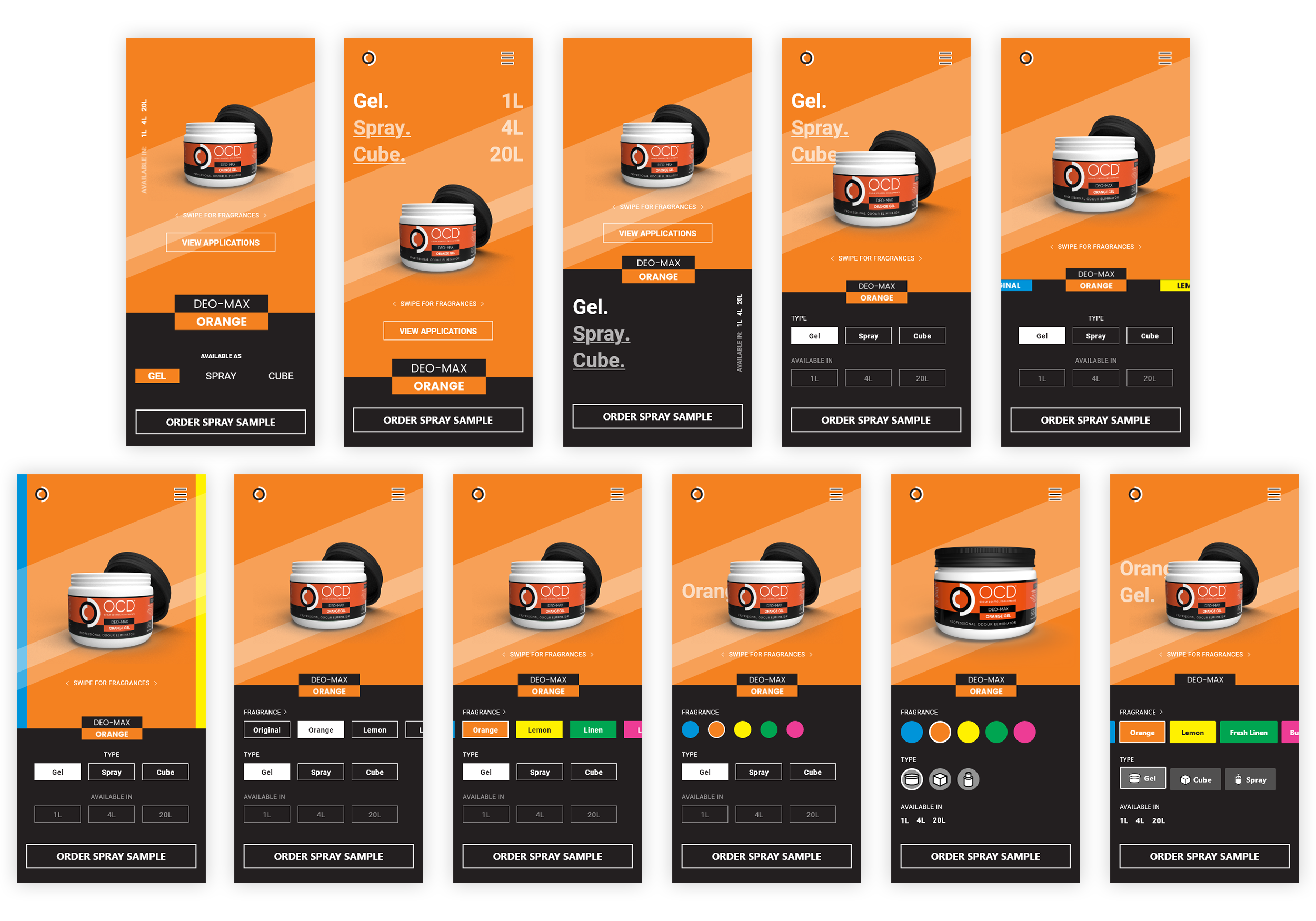
User testing narrowed down the most effective page layout to an easy to reach navigation at the bottom and image at the top.
The first round of testing included static images of each variation, which could be changed with the selectors. Animation between each image was added to provide a smoother experience. This led to users attempting to swipe between fragrances, so a swiping capability was also added.
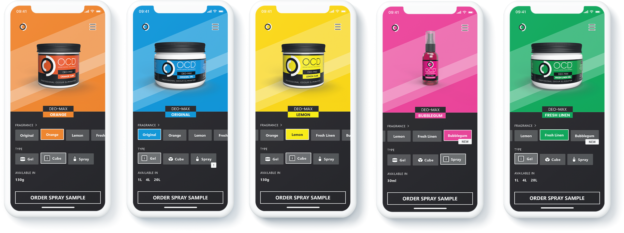
Two rows of selectors - split into 'fragrance' and 'type' - allowed users to quickly navigate through all possible combinations. Icons were included on the type selectors to help differentiate the options and aid users' understanding of the different types.
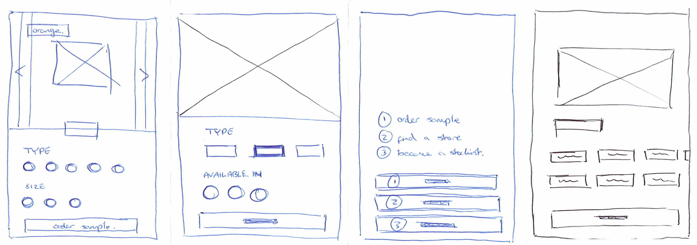
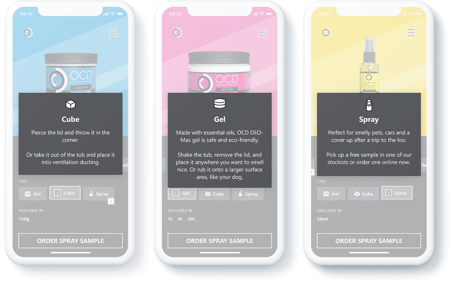
Testing showed the icons helped users familiar with the product line, but first time users needed more information on the differences between each type.
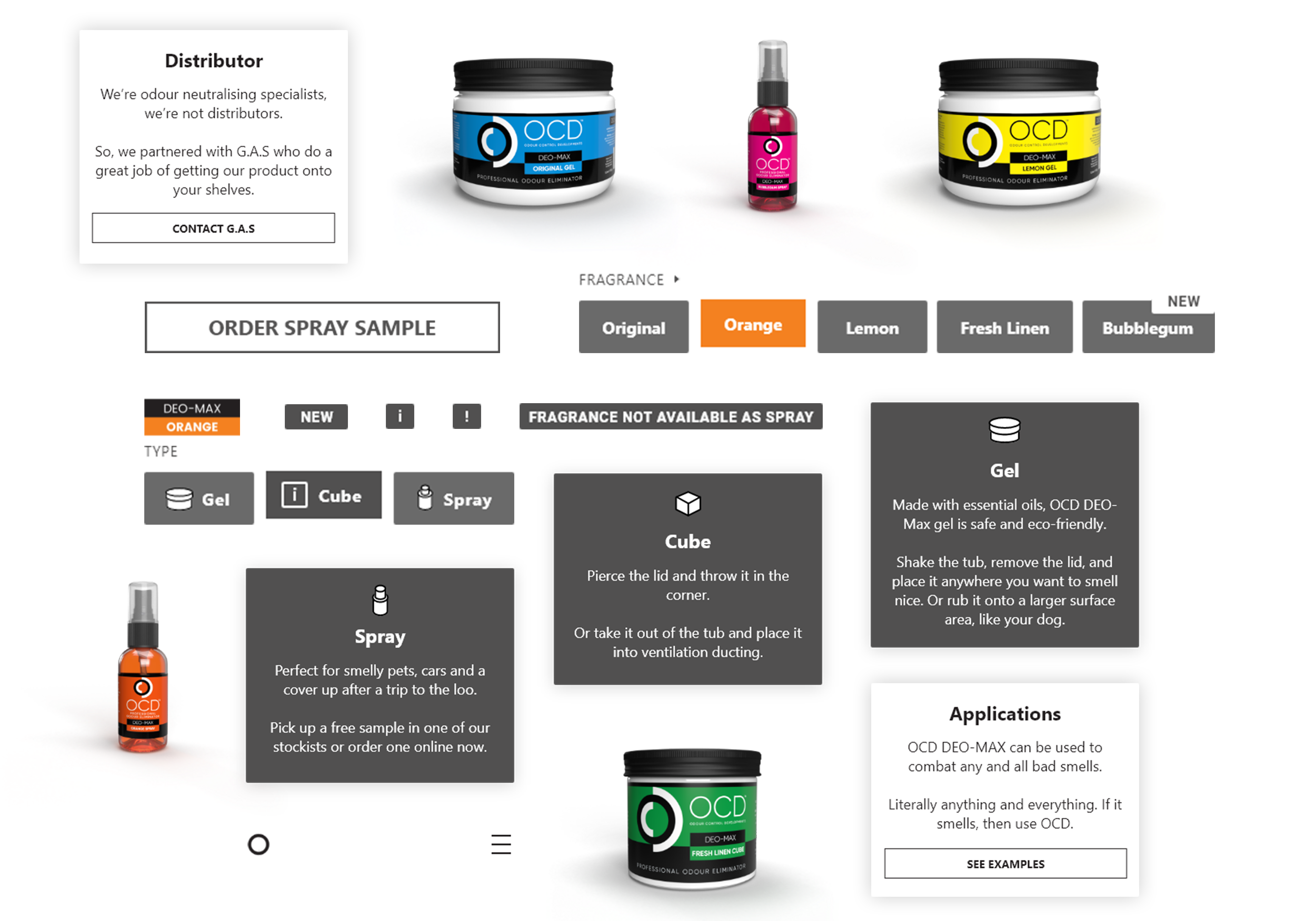
To aid with this, dialogue boxes were added, activated by a second tap of the active type selector and illustrated with a separate icon. More testing is scheduled to determine the icons' effectiveness.
Using feedback from testing, I refined the design of the product page, finalising it for implementation into the site.
I created a style guide and library of patterns and assets, ready for handover to the developer.
This project tested my time management and taught me the importance of communication with developers throughout the design process, in order to work out if certain ideas are achievable in the project timeline.
I learned the importance of including animation in prototypes when testing, if the animation could help to build the user's mental model.
The project taught me the importance of anticipating users journey both on and off site.
After launch, we discovered that a lack of stockists in certain areas could leave some users with no where to order a sample to.
Once we realised this, we included a button for them to get in touch on social media.
But, had we have done more user journey exploration earlier on, we may have been able to predict this situation before it happened.